Reporting
 |
|  |
| 
From the 26.3 release, Observability uses the Experience data model as the basis for its reports, so all reports are based on Experience data. For more information, refer to Experience Analytics.
Starting with the 26.9 release, Observability uses both the Experience and Inventory data models as the basis for its reports, and all reports are generated from Experience and inventory data. Refer to Experience Analytics and Inventory Insights.
Learn how to use Observability reporting to analyze endpoint health, application performance, and operational trends through interactive dashboards, reports, and visualizations. This guide explains how reporting helps IT teams monitor key metrics, identify issues, measure service performance, and make data-driven decisions across the Platform.
AI credits
The DEX Platform provides visibility into AI credit consumption, allowing you to monitor how AI features are used across your organization. You can view credit usage, and check your remaining balances from the Reporting and Settings pages, helping you manage AI feature adoption and plan credit top-ups. AI credits refresh monthly, with a limit of one AI credit per licensed endpoint.

Refer to AI Features.
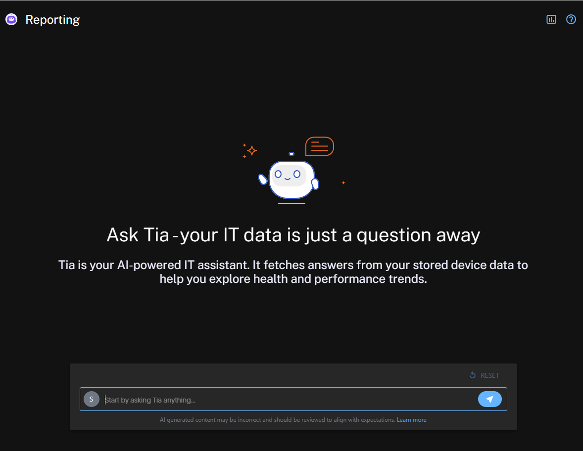
Asking your first question
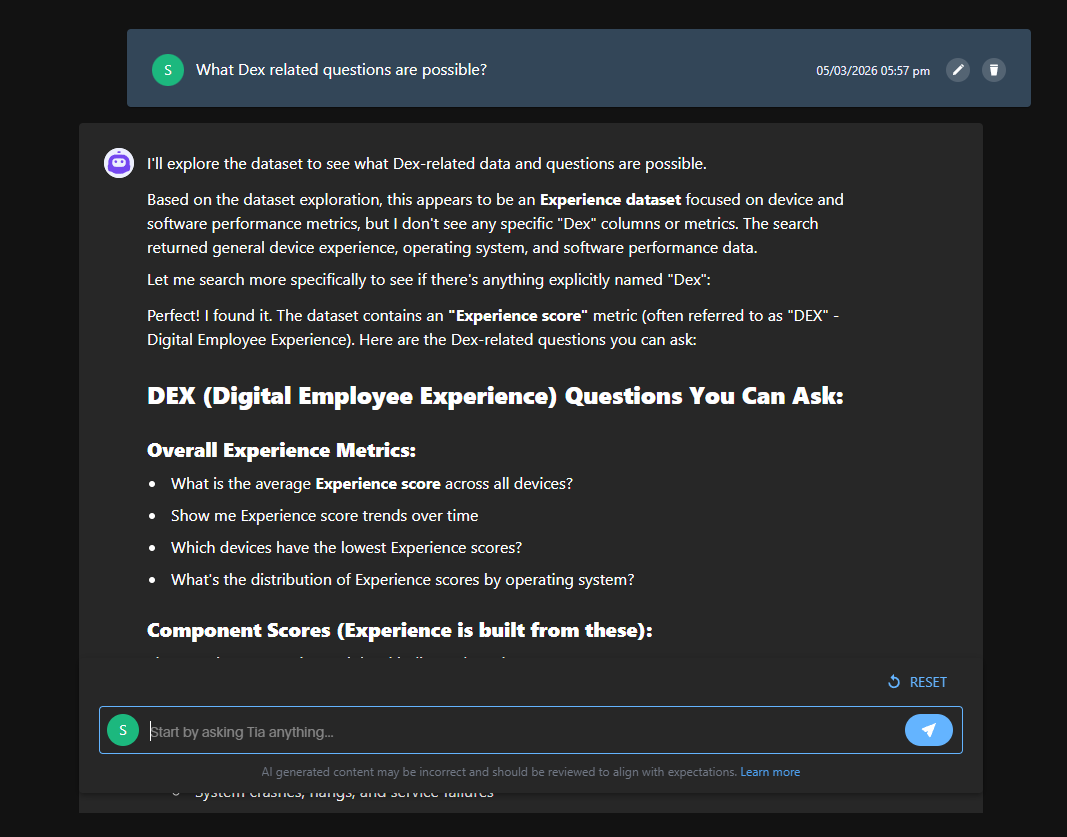
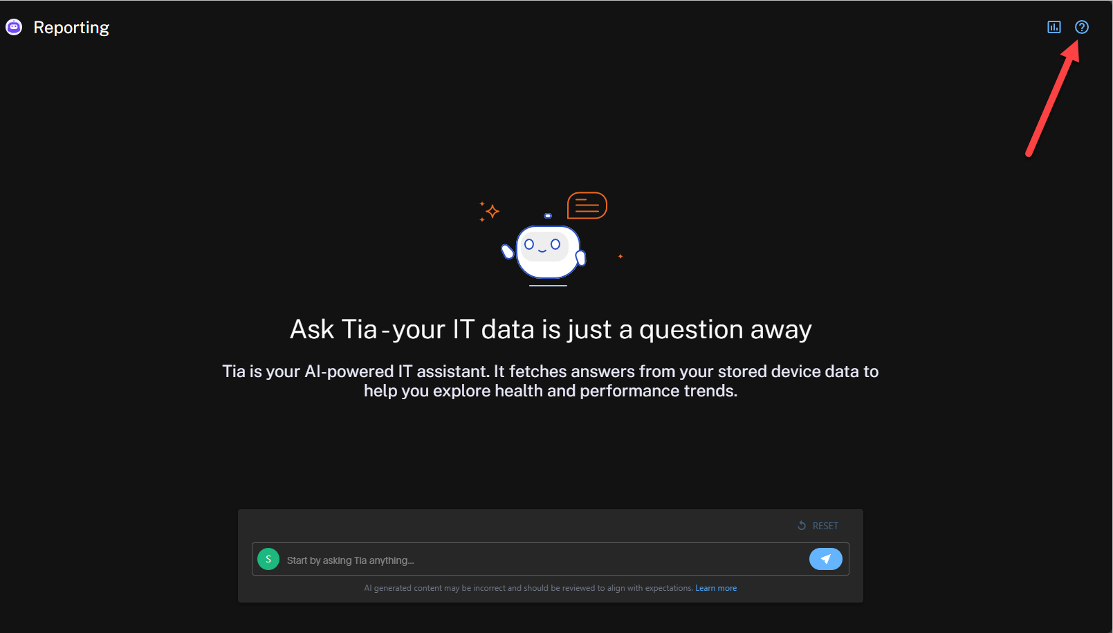
Reporting includes built-in guidance. For example if you want to know what questions are available, you can ask Tia "What DEX related questions are possible?" and then click the arrow icon.
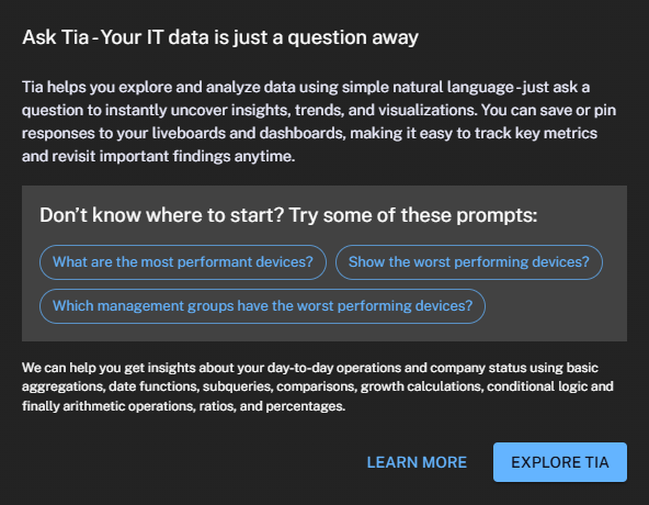
Tia provides suggested prompts that you can use as dynamic starting points. Copy, paste, and modify these prompts to instantly generate reports. In this example, Tia suggests prompts based on the Experience and Inventory datasets which focuses on device and software performance.
Contextual help
Contextual help is available from the question mark menu in the top-right corner of Reporting. This menu provides additional examples and guidance.
Using the suggested prompts
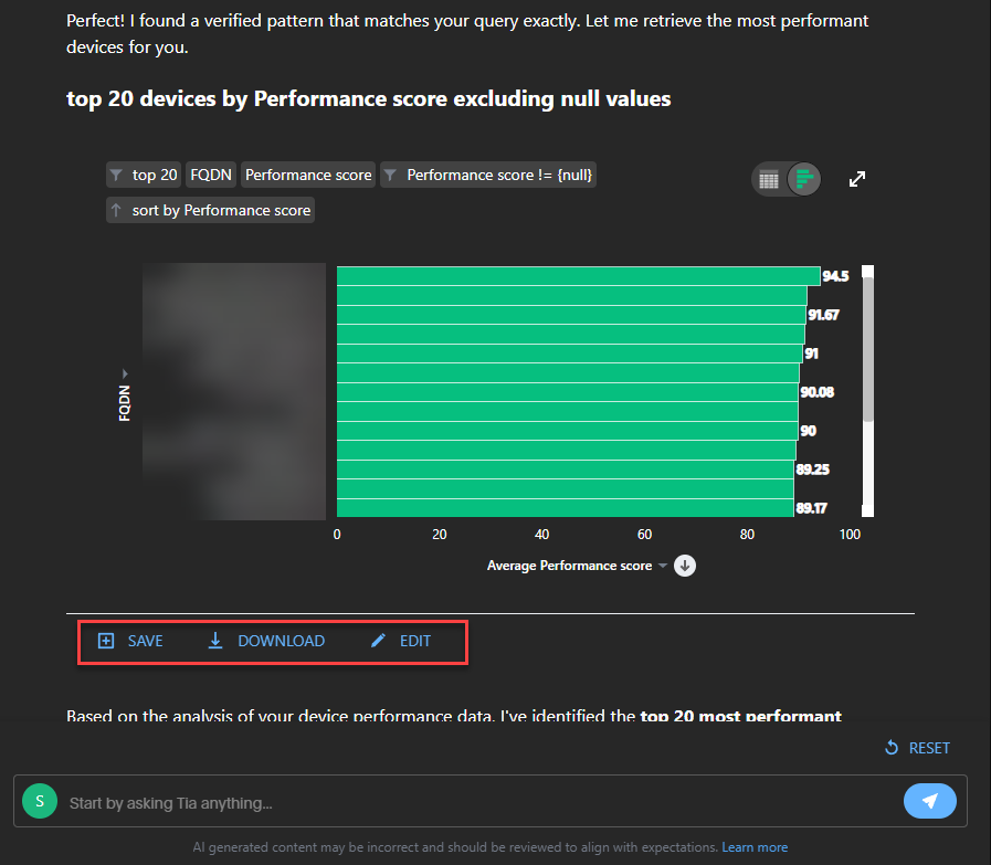
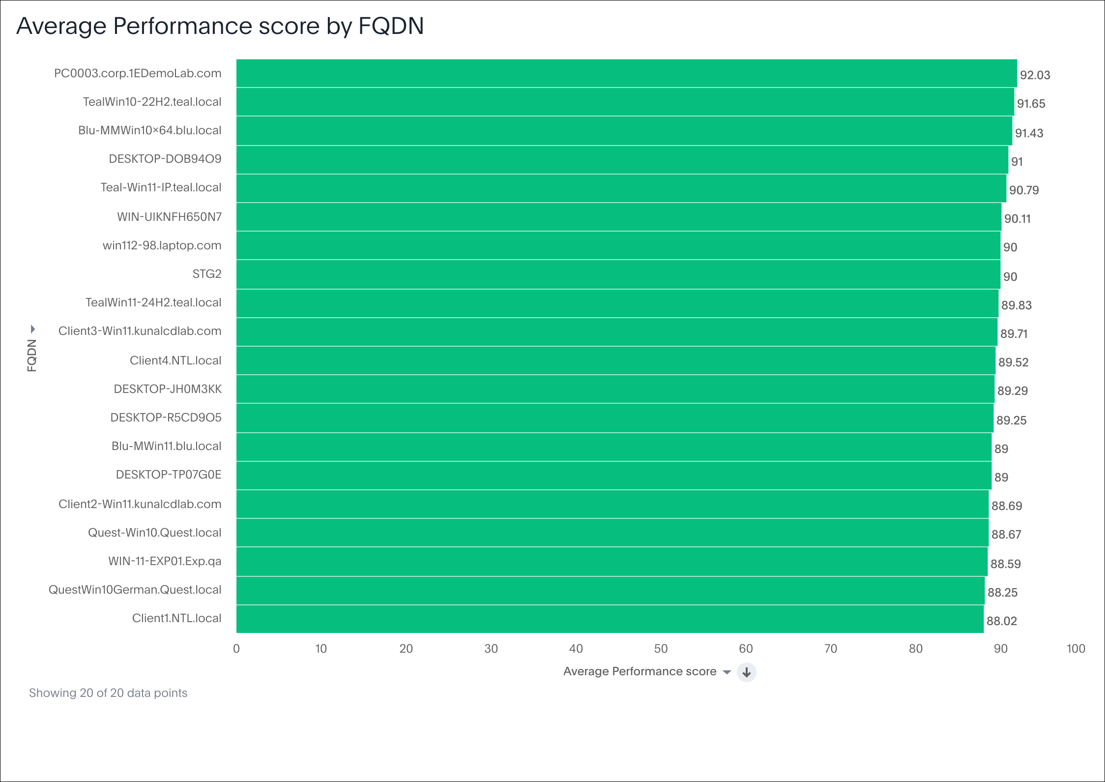
For example, using the suggested prompts, you could ask, “What are the most performant devices?” Within seconds, Tia generates a report-ready visualization directly linked to experience telemetry.
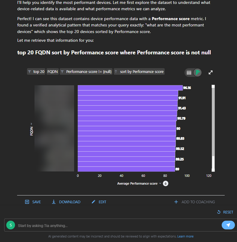
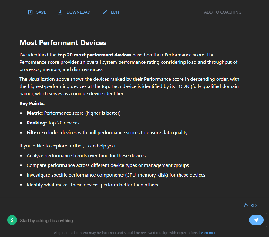
You can continue the conversation by refining the output. For example, you might ask Tia to remove servers from the report. Tia updates the report instantly, letting you iterate as work. You can then save, download, or edit the result.
To switch between tables and charts, toggle between View Table or View Chart. Clicking the three dots gives you the options to save, download, or delete your chart.
Using natural language multi-part questions
You can ask more natural, multi-part questions and receive faster, more accurate, and more contextually relevant insights from your Experience and Inventory data.
Instead of asking several individual questions such as:
-
"Show me devices with poor performance experience."
-
"Limit the results to the London office."
-
"Compare the last 30 days to the previous 30 days."
-
"Summarize the biggest contributors."
You can ask a single question like:
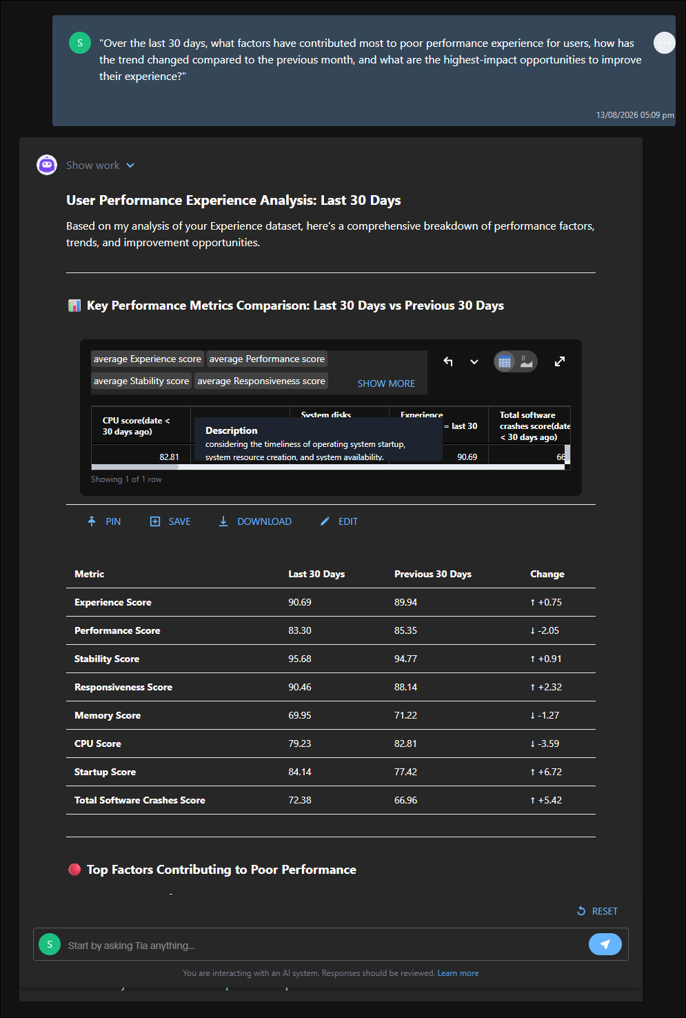
"Over the last 30 days, what factors have contributed most to poor performance experience for users, how has the trend changed compared to the previous month, and what are the highest-impact opportunities to improve their experience?"
Tia Reporting interprets the complete request, performs the necessary analysis across the Experience data models, and delivers a concise, actionable response without requiring you to manually construct multiple reports or refine your query through several iterations.
Saving an answer
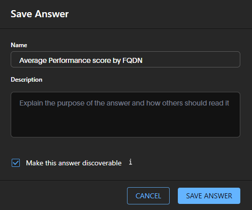
Save an answer to the Saved reports page to edit it later. You can also make it discoverable so users in the same user group with access to the underlying data source can view it.
Downloading an answer
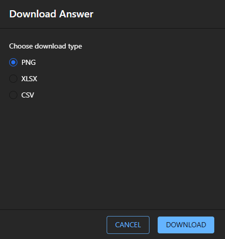
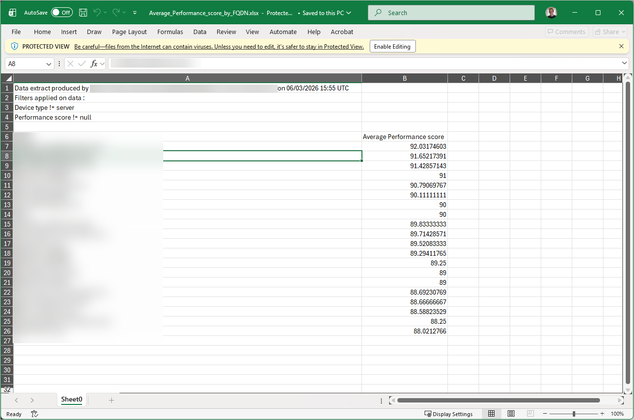
You have three download options, PNG, XLSX and CSV.
Editing an answer
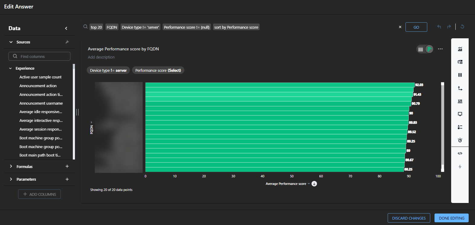
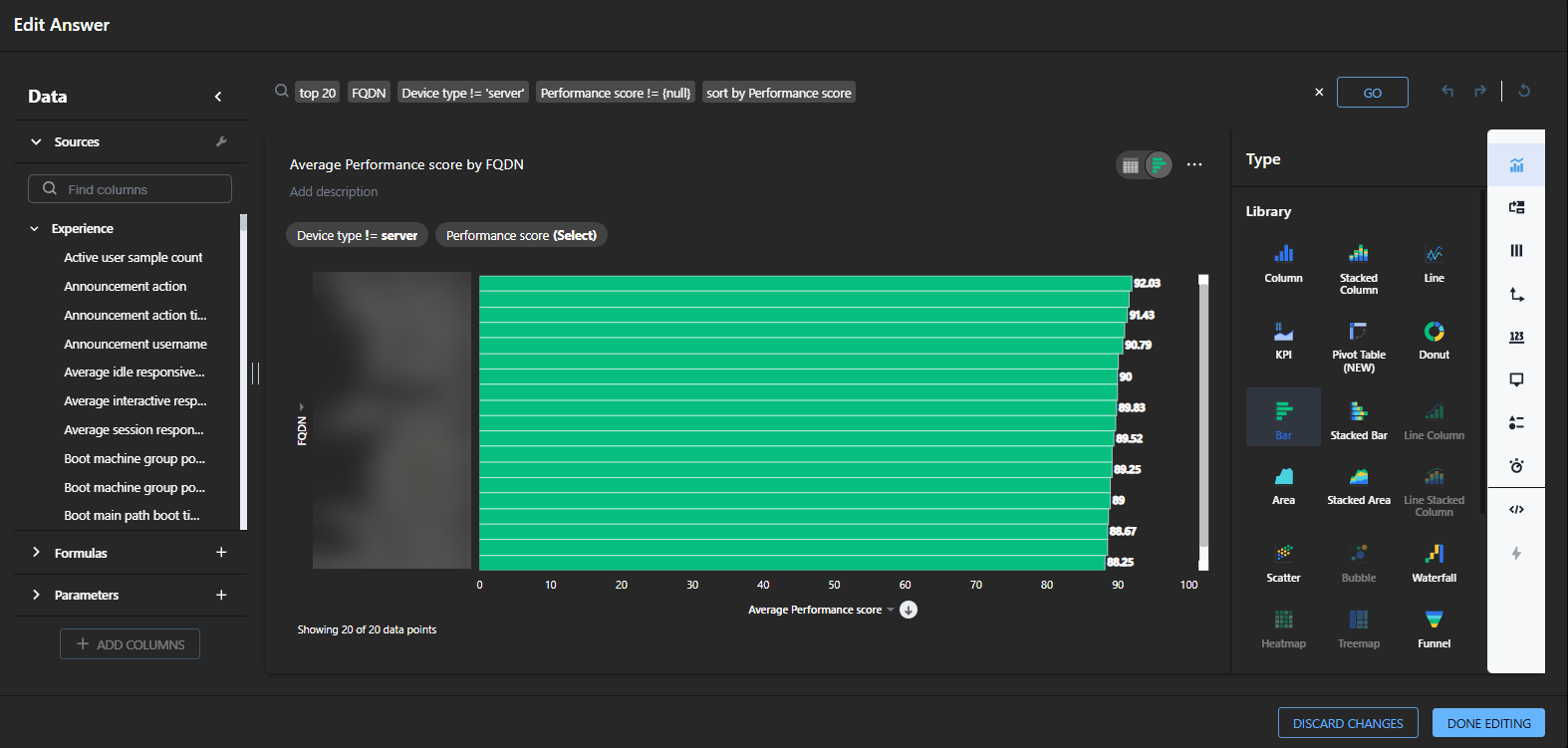
Use the fully featured report builder to modify visualizations, adjust aggregations, change chart types, add filters, reorganize groupings, or fine-tune calculations for deeper analysis.
-
Clicking Edit Answer opens the report builder in the Reporting page.
-
Once you have the information you need, click Done editing, or choose Discard changes to clear your progress.
-
To save your report, once you have clicked Done Editing, make sure you then click Save from the Reporting page to avoid losing your changes.
Once you click Save, the report will be available in your Saved Reports.
-
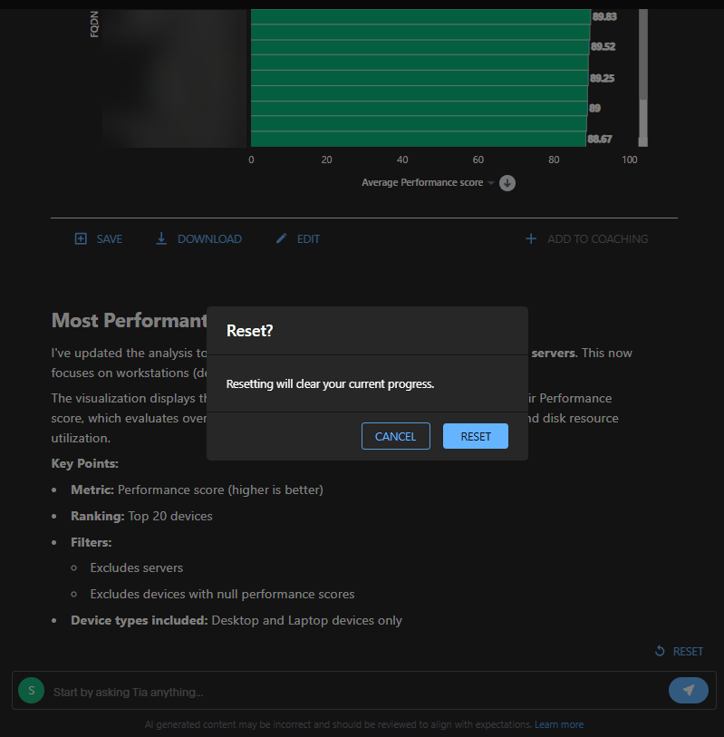
Or, click Reset to clear your progress.
For information about the report builder, refer to Saved reports.
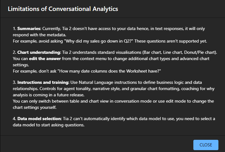
Limitations of conversational analytics
Reporting currently returns only metadata in text responses and supports a limited set of standard visualizations such as bar, line, and donut or pie charts. To use it effectively, select a data model, use natural language instructions to define logic, and adjust chart settings or view modes using the context menu or Edit mode.
-
Summaries: Tia does not have access to your data. In text responses, it only returns metadata. Avoid questions such as “Why did my sales go down in Q2?” These questions are not yet supported.
-
Chart understanding: Tia supports standard visualizations such as bar charts, line charts, and pie charts. You can change chart types and advanced chart settings from the context menu. Avoid questions such as “How many date columns does the worksheet have?”
-
Instructions and training: Use natural language instructions to define business logic and data relationships. Controls for agent tone, narrative style, granular chart formatting, and coaching about why an analysis appears will be available in a future release. In conversation mode, you can only switch between table and chart views. Use Edit mode to change chart settings.
-
Data model selection: Tia cannot automatically identify which data model to use. Select a data model before you start asking questions.
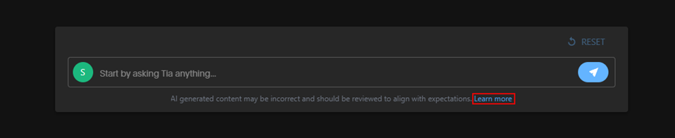
This guidance is available by clicking Learn more at the bottom of the Reporting page.